Multi-Brand Experience Framework
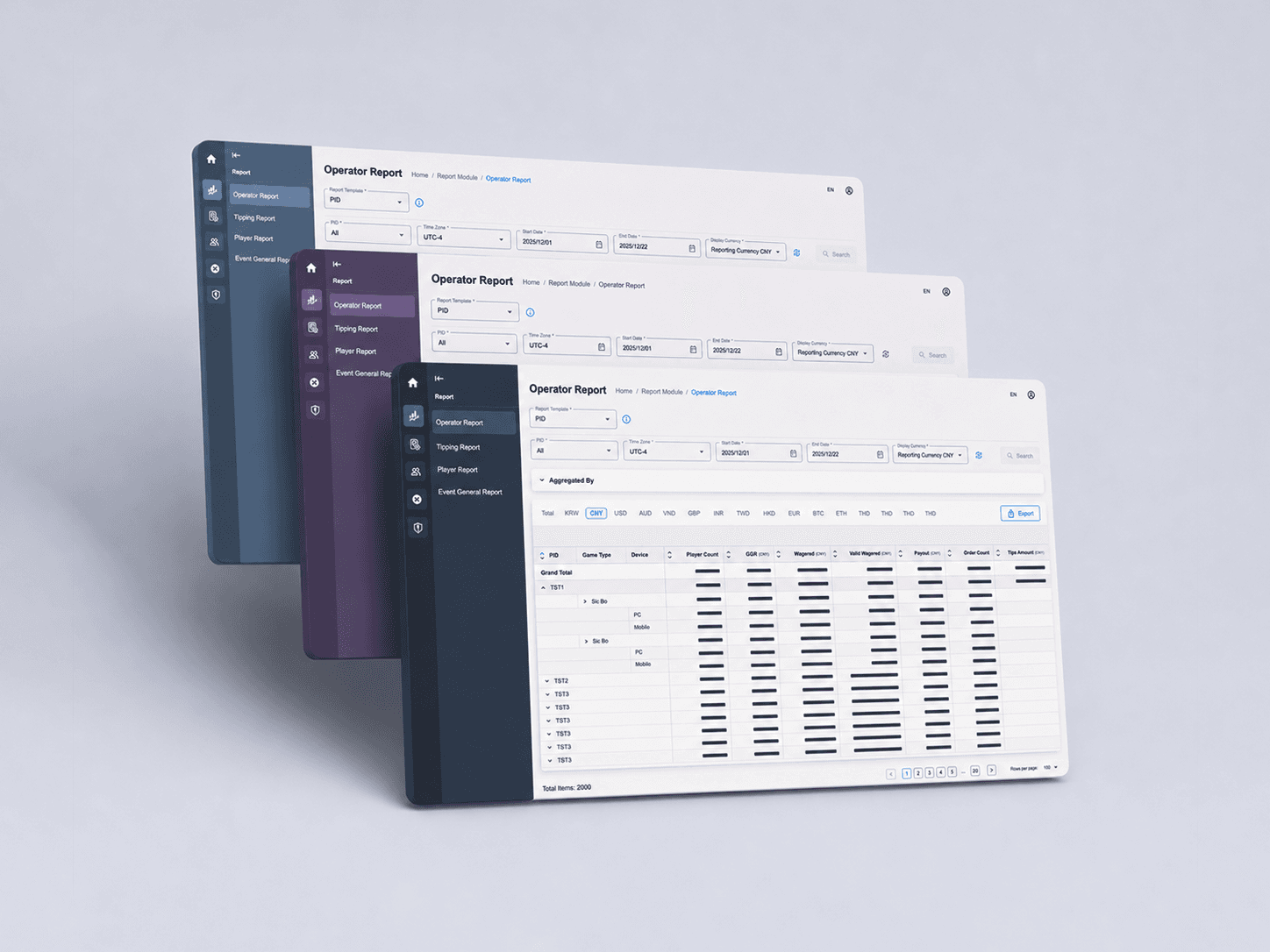
Designed a scalable white-label theming framework that enabled multiple operator brands while maintaining a consistent, usable experience across a complex gaming back office platform.
Exploration & Research
When the Back Office platform was repositioned as a white-label product, the business needed a way to support multiple operator brands without rebuilding the product for each client.
The initial request seemed straightforward: apply different brand identities to the existing platform.
However, applying a brand identity to an operational product raised a more fundamental design question: how much branding could the experience accommodate without affecting usability?
Back Office systems are operational tools used daily by operators, customer service teams, finance teams, and administrators. Unlike marketing websites, users spend hours interacting with dense tables, reports, filters, dashboards, and transactional data.
This raised an important question: How much branding is appropriate in an operational product?
I reviewed well-known enterprise SaaS products, analytics dashboards, and operational platforms to understand how mature products balanced branding with usability. I also experimented with AI-assisted concept generation to quickly explore different visual directions and test assumptions.
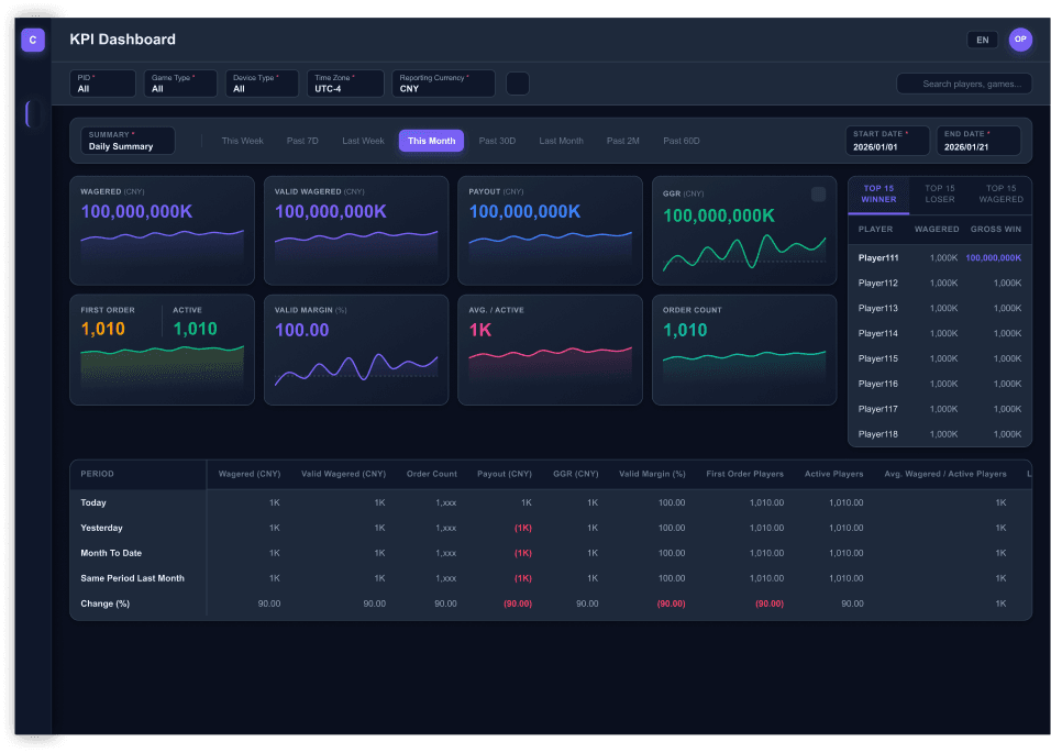
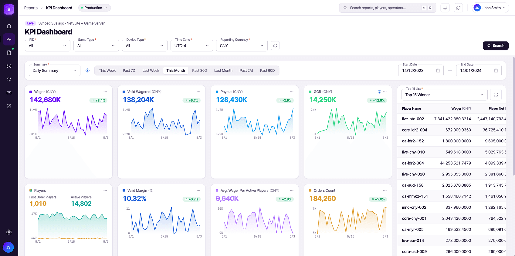
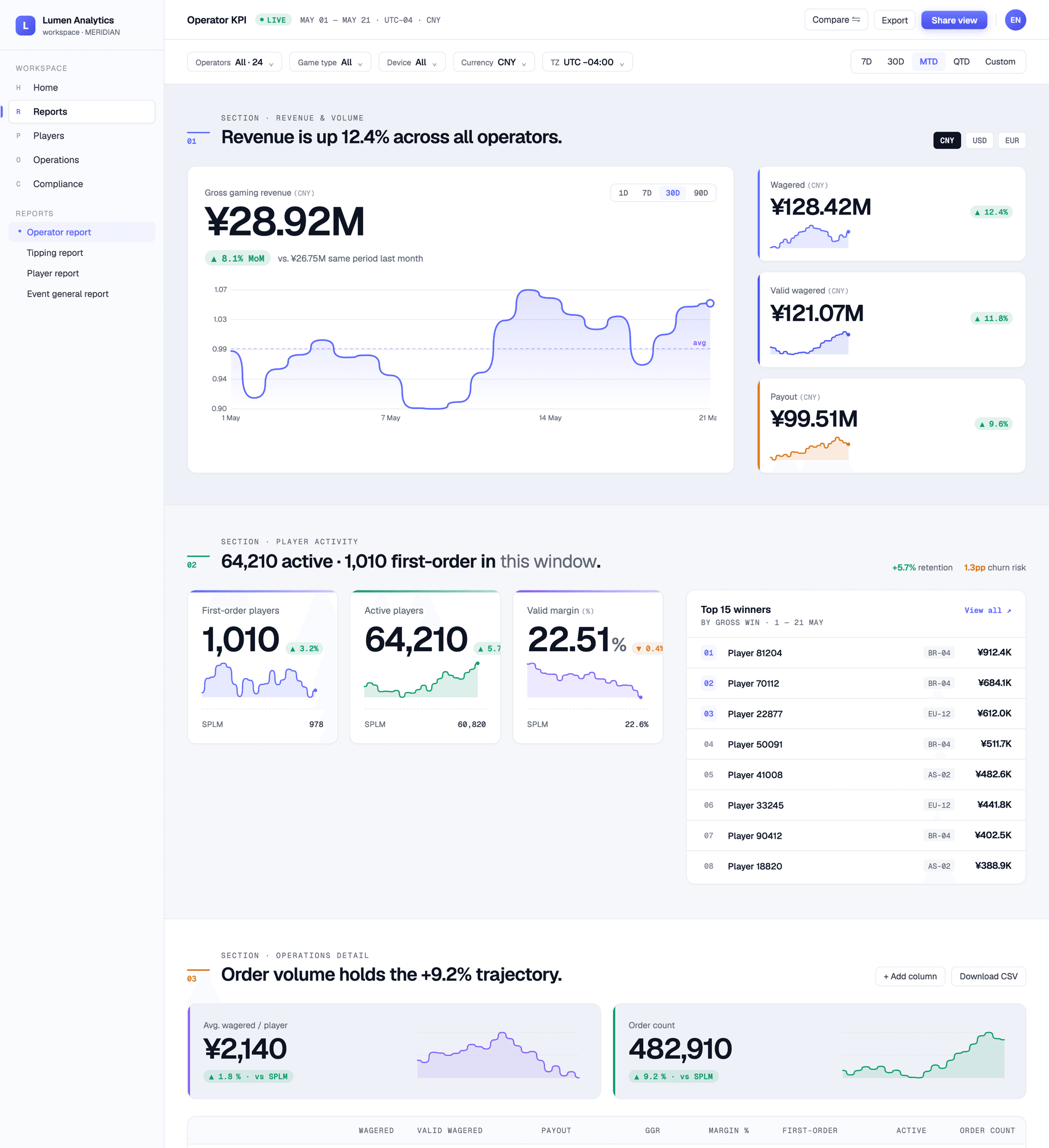
The goal was not to generate production-ready designs.
Instead, the exploration helped evaluate questions such as:
1. Which parts of the interface could safely adopt stronger branding?
2. Which visual elements already carried operational meaning?
3. How much visual change could be introduced before usability began to suffer?
4. How could multiple brands coexist while maintaining a consistent user experience?
As concepts evolved, a clear pattern emerged. Brand colours applied too broadly made operational information harder to scan and reduced consistency across workflows. The strongest concepts were those that treated branding as a layer applied selectively rather than a visual treatment applied everywhere. This insight became the foundation for the theming framework.
Theme Principles
The exploration ultimately led to four guiding principles.
Principle 1: Operational Usability First
Operators spend most of their time reviewing reports, monitoring performance, and investigating transactions.
Usability and readability should always take priority over brand expression.
The majority of the colurs is either soft or neutral. Branding should support the experience rather than dominate it.
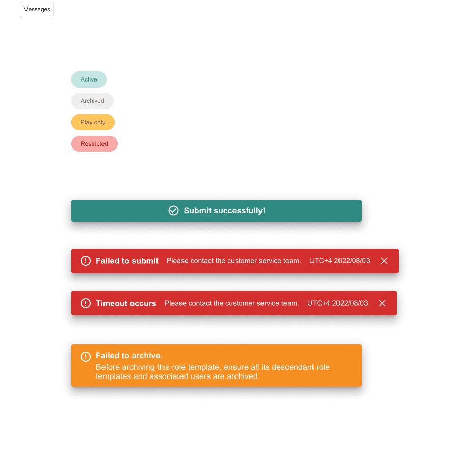
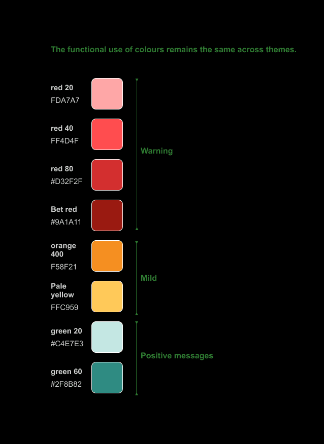
Principle 2: Functional Colours Are Stable
Colours that communicate operational meaning should remain consistent across all brands.
Examples include: Success states, Error states, Warning messages, Informational messages and Status indicators
Users should not need to relearn the meaning of colours when switching between brands.
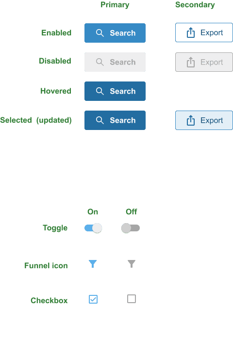
Principle 3: Brand Colours Are Reserved for Emphasis
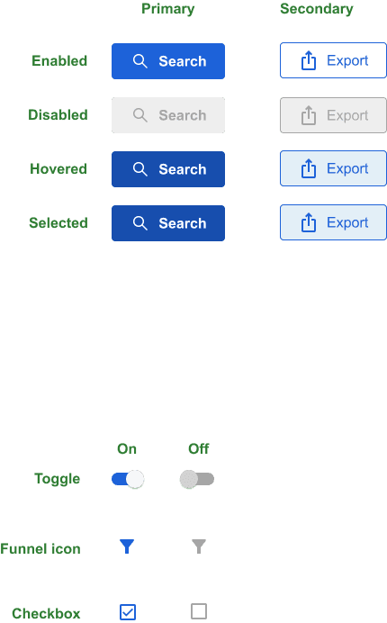
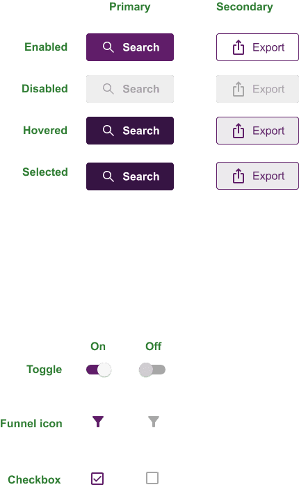
Brand colours are used for preferences and information emphasis, including: Primary actions, Secondary actions, Navigation highlights, Selected states and Brand surfaces.
This allows each operator to establish a distinct identity without disrupting established workflows.
Principle 4: Chart Colours Are Separate
Data visualisations serve a different purpose from interface branding.
Charts require sufficient contrast, distinction between series, and consistency across reports.
For this reason, chart palettes were treated as a dedicated system rather than inheriting brand colours directly.
This ensured data remained easy to interpret regardless of the active theme.
Building the Theme Framework
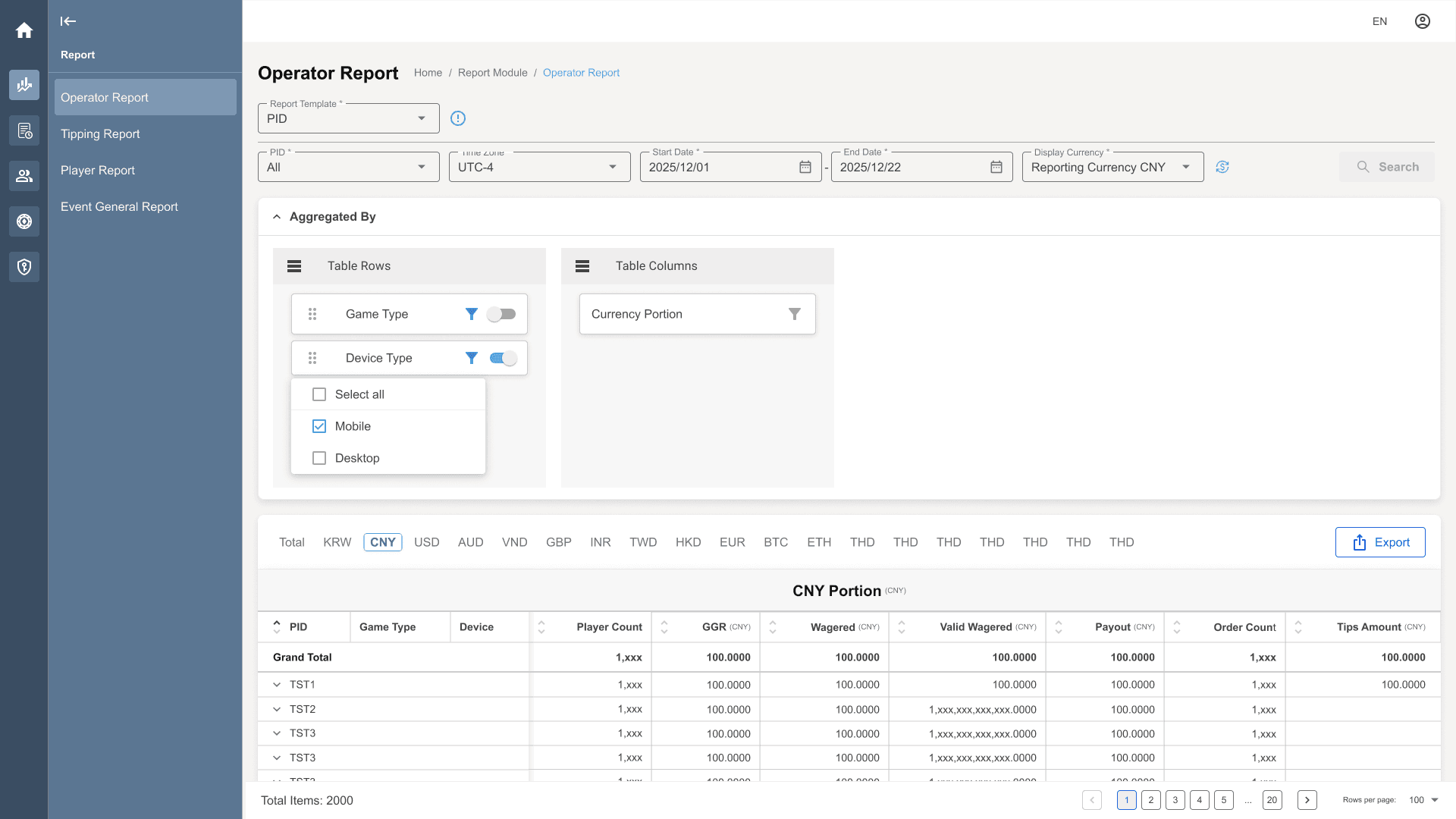
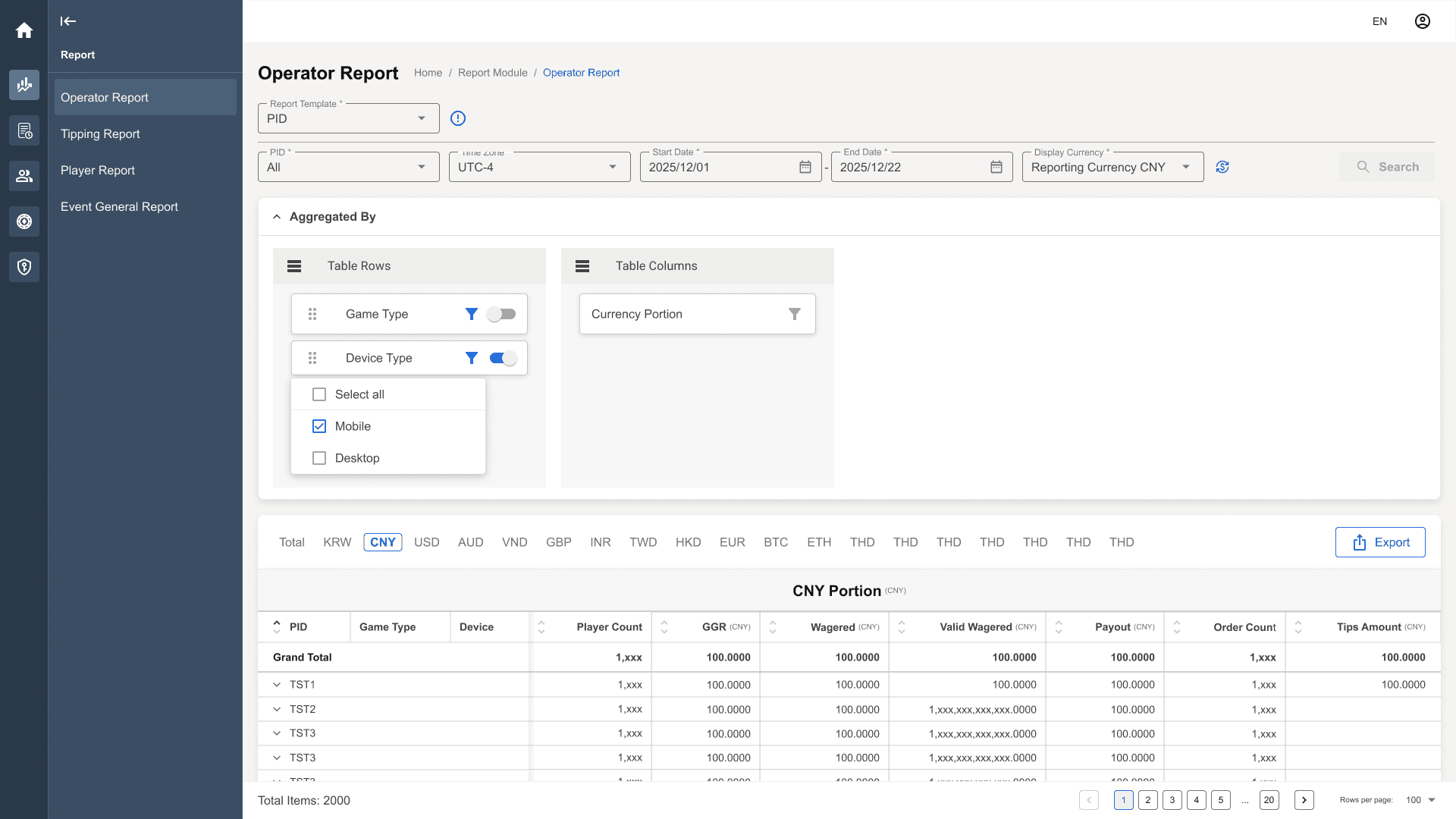
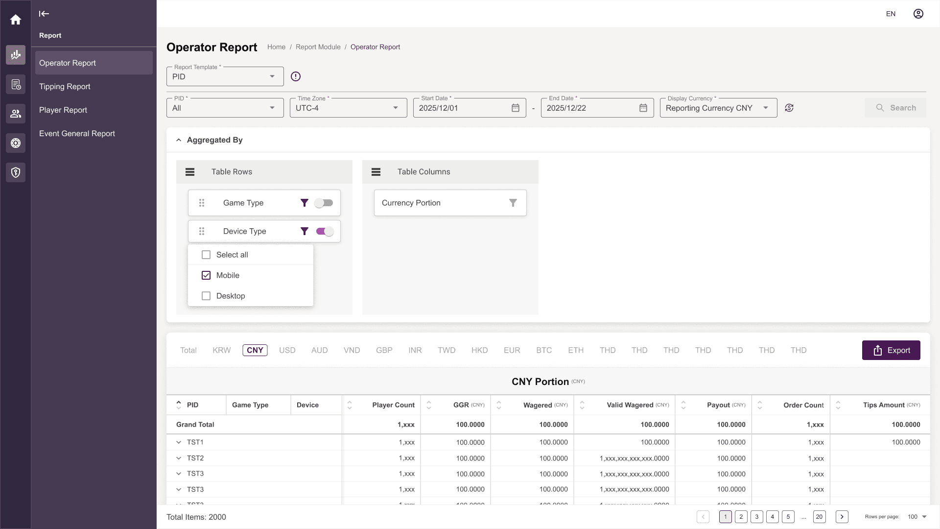
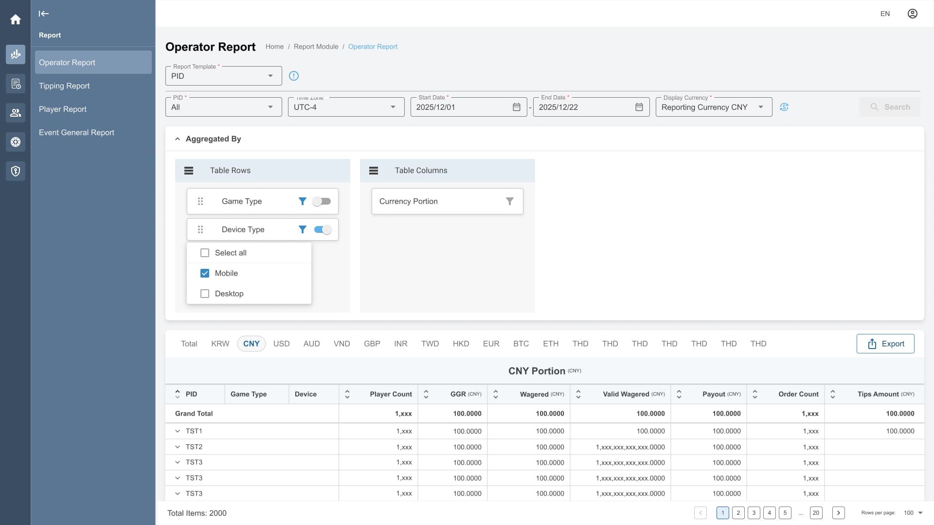
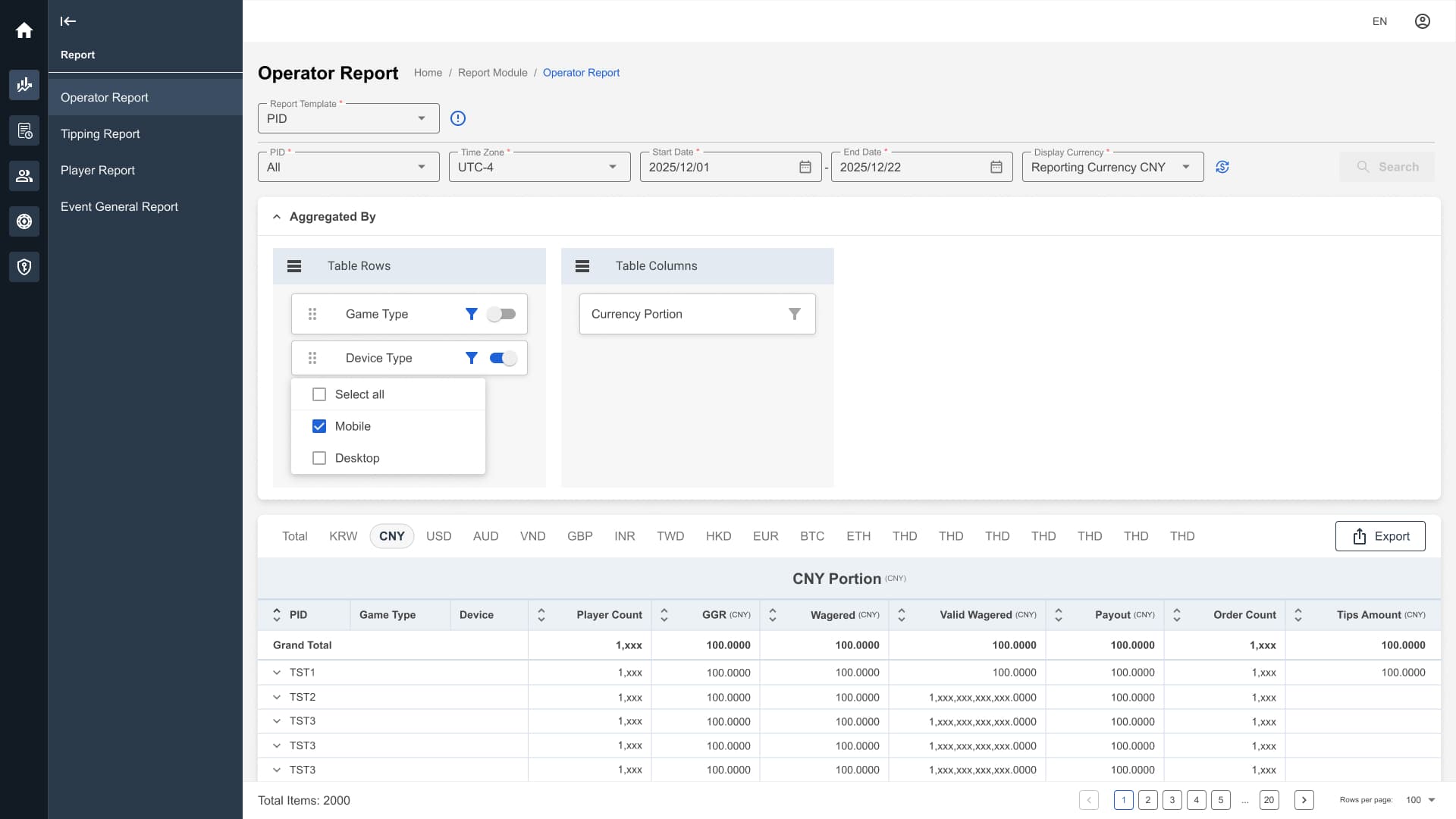
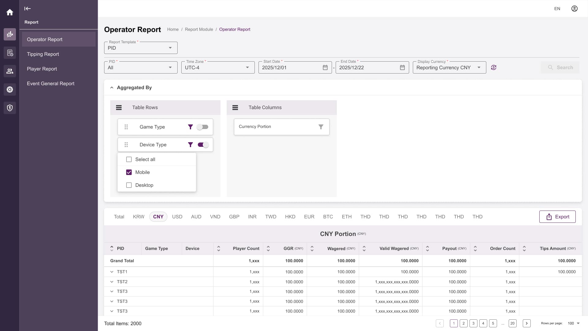
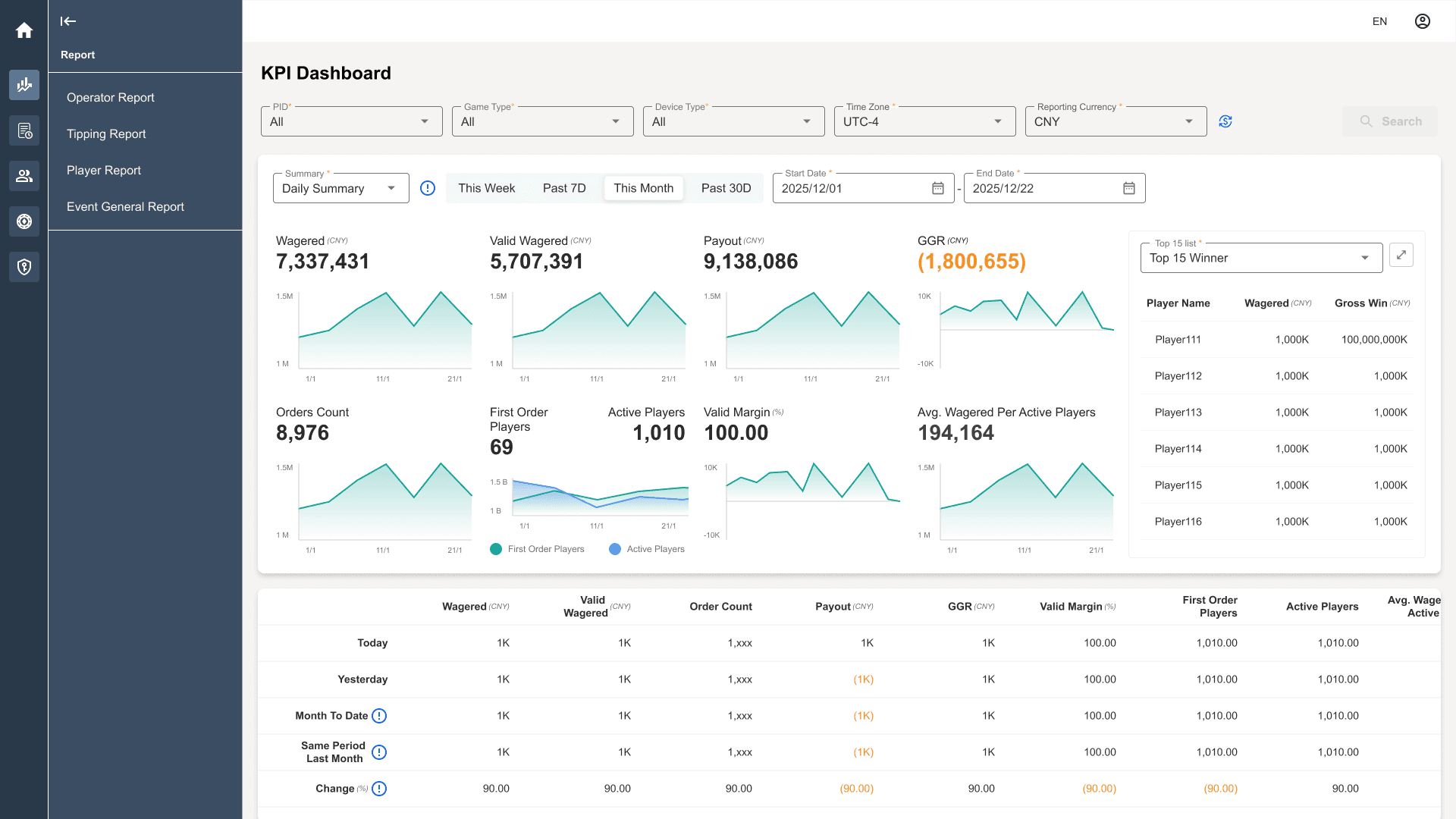
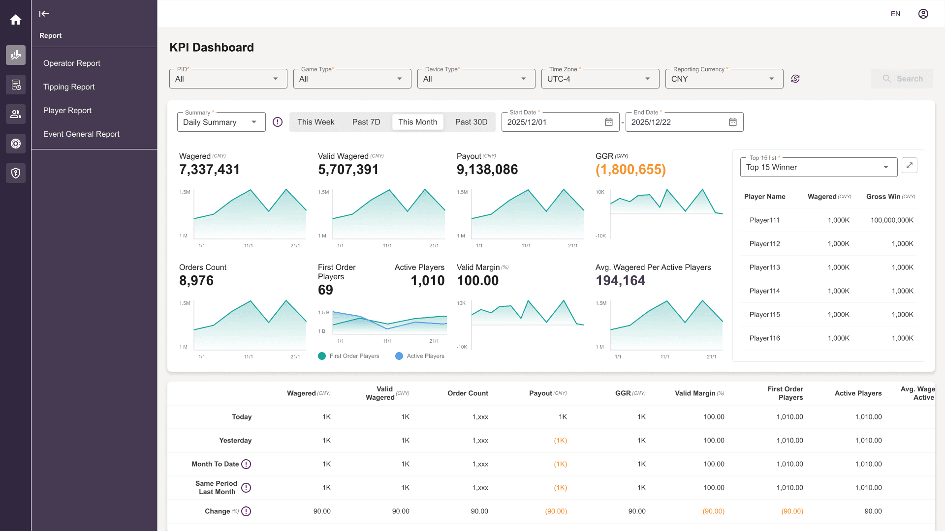
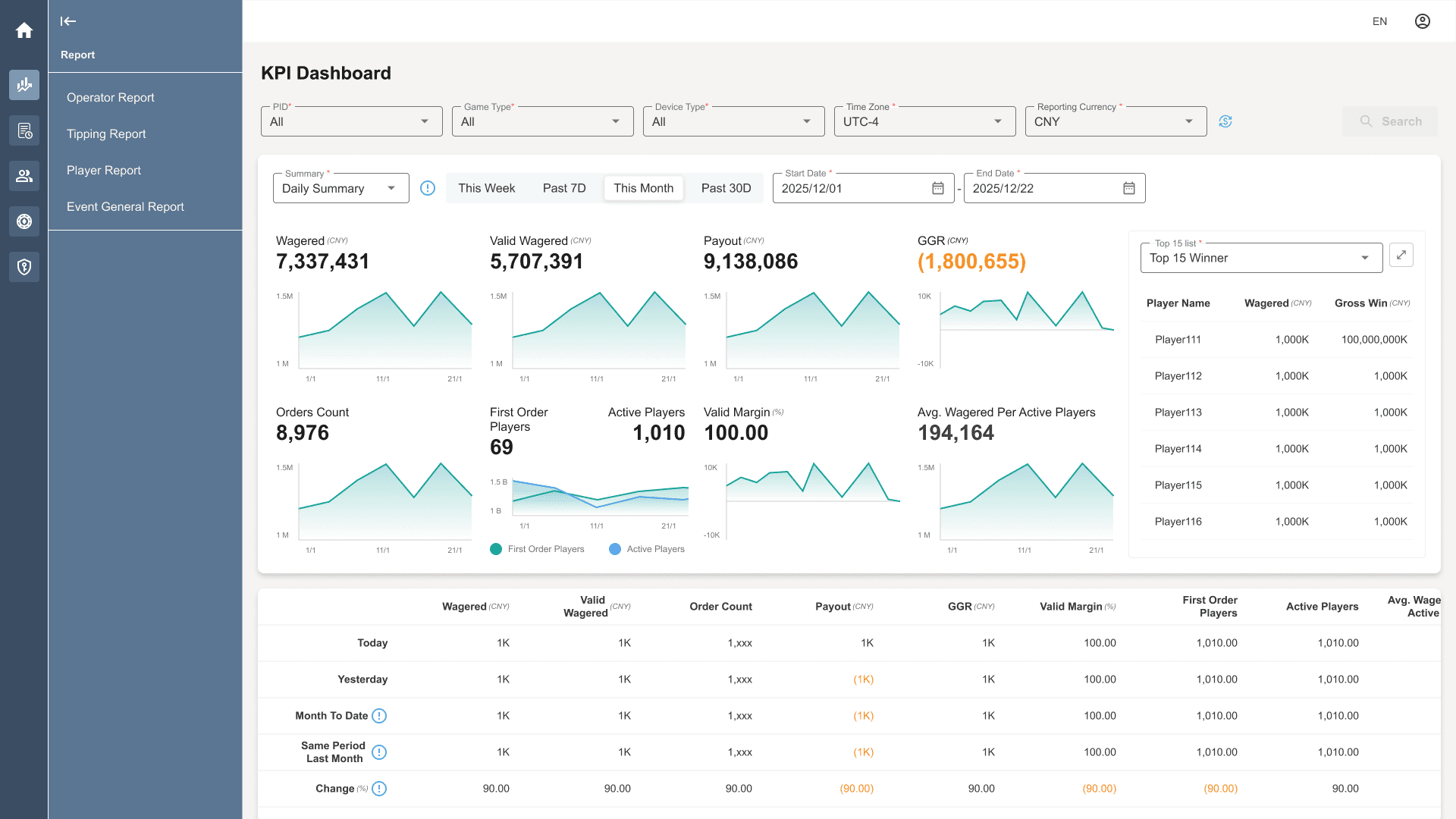
Once the senior management decided one of the color theme direction (Operation-first Backoffice), I created a colour framework that separated operational meaning from brand expression by design tokens.
The entire colour framework is consisted of 3 colour groups:
- Charts and Graphs. The set of colours remains unchanged across themes.
- Functional colours remain unchanged across themes
- Brand colours are applied to actions and information emphasis
This approach allowed multiple brands to share the same product behaviour while maintaining distinct visual identities.
The framework provided a reusable foundation for future brands, allowing additional operator themes to be introduced while maintaining consistent product behaviour and operational meaning.