IGT Lottery Platform Ecosystem
Redesigning transactional lottery experiences across responsive web, mobile, and white-label platforms.
Role
UI/UX (web) Designer
Year
2022-2023
Category
Product Experience Design

IGT Lottery Platform Ecosystem
Overview
IGT delivers digital lottery and gaming experiences across multiple US states, supporting transactional journeys across responsive web and mobile platforms.
My work focused on improving workflow consistency, simplifying complex transactional experiences, and creating scalable design foundations capable of supporting multiple products, gameplay types, and branded environments.
This case study highlights three key initiatives:
- 1Responsive Platform Redesign
- 2Lottery Group Feature
- 3White-label Product Customisation
Responsive Platform Redesign


The Challenge
As the platform evolved, products had grown independently over time, resulting in inconsistent navigation patterns, fragmented workflows, and varying user experiences across devices.
The challenge was not simply to modernise the interface, but to create a more cohesive ecosystem capable of scaling across products and future platform enhancements.
Understanding the Existing Experience
The project began with a comprehensive UX and interface audit across existing responsive experiences.
The review focused on:
- Navigation structures
- Transactional workflows
- Mobile responsiveness
- Form usability
- Interaction behaviours
- Accessibility considerations
- Layout consistency
- Information hierarchy
The audit revealed recurring inconsistencies that increased cognitive load and made transactional tasks more difficult for users to complete confidently.
Design Principles
Four UX principles guided the redesign.
Affordance
Primary and secondary actions were restructured to create clearer visual hierarchy, while navigation elements were reinforced through recognisable iconography and consistent interaction patterns.
Information Hierarchy
Content was reorganised to prioritise task-critical information, helping users quickly understand available actions, account status, and gameplay information.
Progressive Disclosure
Complex subscription and purchase journeys were broken into manageable stages, allowing users to focus on one decision at a time while maintaining visibility of overall progress.
Visual Grouping (Gestalt Principles)
Related information was organised into structured containers, helping users distinguish between account details, game information, transaction history, and system status.
Navigation & Workflow Optimisation
One of the most significant initiatives involved improving navigation and transactional discoverability.
The redesign introduced:
- Clearer account management pathways: Using step-by-step approach to guide the user through finishing the subscription process
- More predictable navigation patterns: For example, using card patterns for game results
- Stronger hierarchy between primary and secondary actions: More saturated colours are used for primary action while keeping secondary action with a neutral background and a bit of accent colour.
These changes reduced complexity while improving overall scanability and workflow efficiency.
Establishing Scalable Foundations
Alongside the redesign, I contributed to the development of a scalable design system that could support future platform growth.
This included:
- Grid and spacing systems
- Responsive layout frameworks (mobile & PC)
- Typography standards
- Reusable interaction patterns
- Shared UI components
The objective was to create a shared interface language capable of scaling across products and jurisdictions while improving consistency between design and development teams.
Prototyping & Delivery
Final deliverables included:
- Responsive UI specifications (mobile + PC)
- Component structures
- Developer handoff documentation
Reflection
This project reinforced the importance of balancing immediate usability improvements with long-term system thinking. Establishing shared foundations not only improved the current experience but also created a framework for future product evolution.
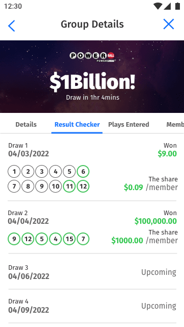
Lottery Group Feature
Overview
Lottery participation is often a social activity, with groups of friends, families, and colleagues pooling resources to increase their chances of winning.
The Lottery Group feature was designed to bring this behaviour into the digital platform, enabling players to create, manage, and participate in shared lottery pools while maintaining clarity around ownership, payments, and participation.
The Challenge
Unlike traditional lottery purchases, group play introduces additional complexity.
Multiple participants contribute to a shared experience while holding different responsibilities, permissions, and financial commitments. The challenge was to create an experience that felt simple for players while supporting the operational requirements behind the scenes.
Defining User Roles
The feature revolved around two primary user roles.
Group Captain
Responsible for:
- Creating groups
- Managing membership
- Configuring lottery settings
- Coordinating participation
Group Member
Responsible for:
- Choosing groups
- Purchasing entries
- Managing their own participation
- Tracking group activity
Understanding these responsibilities became the foundation for the entire experience.
Mapping the Group Lifecycle
The design process began with:
- User story creation
- Role analysis
- Lifecycle mapping
- Workflow modelling
This helped define interaction requirements across the complete participation journey while identifying dependencies, permissions, and edge cases.
Designing the Experience
The workflow included:
- 1Group discovery
- 2Invitation management
- 3Group onboarding
- 4Membership participation
- 5Lottery configuration
- 6Purchase and checkout
- 7Confirmation and tracking
One of the primary design challenges involved balancing backend operational complexity with transactional clarity. Every decision needed to support complex business rules while remaining understandable for everyday players.


Research & Validation Strategy
To better understand real-world lottery group behaviour, I proposed a research framework focused on:
- Financial coordination habits
- Player Communication patterns
- Workflow comprehension
- Onboarding effectiveness
Although organisational changes prevented execution, the framework established a clear validation path for future development.
Reflection
While the project was ultimately paused, the work strengthened my experience in:
- Workflow modelling
- Transactional UX design
- Collaborative systems
- Research planning
- Workflow validation
- Scalable interaction design
Most importantly, it reinforced the importance of hiding operational complexity behind experiences that feel simple and intuitive.
White-label Product Customisation
Overview
In addition to core product work, I supported the adaptation of the lottery platform across multiple white-label implementations.
The objective was to enable different client brands and operational requirements while maintaining a shared product foundation.
Project scope
The platform was designed to support multiple branded experiences without compromising consistency or implementation efficiency.


My responsibilities included:
- UI customisation
- Brand system adaptation
- Accessibility considerations
The challenge was balancing four competing priorities:
- Platform consistency
- Client flexibility
- Development efficiency
Component Toolkit Adaptation
The reusable component toolkits enabled rapid customisation while preserving a consistent interaction model across products.
This included:
- Adaptable colour systems
- Typography structures
- Navigation patterns
- Reusable game-related components
The result was a flexible framework that reduced implementation overhead while supporting multiple branded experiences.
Summary
Across all three initiatives, the common goal was creating scalable workflow structures and interaction systems capable of supporting long-term platform evolution.
Rather than treating each product surface independently, the work focused on building reusable foundations that could scale across platforms, gameplay types, user states, and branded experiences.